


comand, or is it time for a change??

Thread Starter
Newbie
Joined: Aug 2004
Posts: 16
Likes: 0
From: wigan,england
clk 230 kompressor
comand, or is it time for a change??
im thinking of steering away from the comand unit.in light of recent events, and given todays multitude of in car technology i ask myself why follow traditional units that are proven,but .........boring!! comand it seems like anything german seems to stagnate in its past revelled glory and refuses to update and keep up with advancement of user friendly media systems.i saw this new system from a uk company and was amazed.it was like a breath of fresh air,i sound like a salesman but it looks fantastic.id appreciate anyones view on this as it will cost around the same price as one of steves retro fits(bearing in mind everything ill have to do to get it fitted)and ill get peace of mind.
views please..
website www.karputer.co.uk
http://www.karputer.co.uk/docs/karpu...mo_june_04.zip
views please..
website www.karputer.co.uk
http://www.karputer.co.uk/docs/karpu...mo_june_04.zip

Senior Member
Joined: Jul 2004
Posts: 323
Likes: 0
From: NYC Tri State Area
2013 w204 C350
Originally Posted by mingaud123
im thinking of steering away from the comand unit.in light of recent events, and given todays multitude of in car technology i ask myself why follow traditional units that are proven,but .........boring!! comand it seems like anything german seems to stagnate in its past revelled glory and refuses to update and keep up with advancement of user friendly media systems.i saw this new system from a uk company and was amazed.it was like a breath of fresh air,i sound like a salesman but it looks fantastic.id appreciate anyones view on this as it will cost around the same price as one of steves retro fits(bearing in mind everything ill have to do to get it fitted)and ill get peace of mind.
views please..
website www.karputer.co.uk
http://www.karputer.co.uk/docs/karpu...mo_june_04.zip
views please..
website www.karputer.co.uk
http://www.karputer.co.uk/docs/karpu...mo_june_04.zip
You could just as easily integrate all of that with the comand unit. Big difference is the look of the installation. IMO the comand is a fantastic unit, 7inch widescreen, dvd + tv playback, etc.. These aftermarket units never look right, always have problems, and don't integrate with steering wheel controls; well unless you have the old d2b system, in which case still never works right.
Fazooley
Super Member
Joined: Feb 2002
Posts: 782
Likes: 6
From: Buffalo NY
3 Porsche rotation
One reported problem with Command you are ready to write it off???  And you believed another aftermarket system will be completely trouble-free??? Personally I preferred the convience of complete integration with steering whell, HU and dash display. This way I can focus on driving instead of playing with the head unit.
John
And you believed another aftermarket system will be completely trouble-free??? Personally I preferred the convience of complete integration with steering whell, HU and dash display. This way I can focus on driving instead of playing with the head unit.John

Member
Joined: Jul 2004
Posts: 223
Likes: 0
From: Pasadena, CA
2000 E430 sport package
Originally Posted by JohnAMG
One reported problem with Command you are ready to write it off??? And you believed another aftermarket system will be completely trouble-free??? Personally I preferred the convience of complete integration with steering whell, HU and dash display. This way I can focus on driving instead of playing with the head unit.
John
And you believed another aftermarket system will be completely trouble-free??? Personally I preferred the convience of complete integration with steering whell, HU and dash display. This way I can focus on driving instead of playing with the head unit.John

Former Vendor of MBWorld
Joined: Jan 2002
Posts: 4,011
Likes: 3
From: global traveller
some slow@$$diesels
Originally Posted by mingaud123
comand it seems like anything german seems to stagnate in its past revelled glory and refuses to update and keep up with advancement of user friendly media systems.

greetingz,
Senior Member
Joined: Sep 2004
Posts: 313
Likes: 4
W212 2009, W115 Pullman & EQC
Trending Topics

Member
Joined: Nov 2002
Posts: 127
Likes: 2
From: San Diego, CA
2000 E320
Here's a good alternate to the MB Command:
https://mbworld.org/forums/e-class-w210/84369-alpine-navigation-ipod-controller-installed.html
https://mbworld.org/forums/e-class-w210/84369-alpine-navigation-ipod-controller-installed.html
MB World Stories
The Best of Mercedes & AMG

Dubai Tuner Gives the Mercedes G-Class An Entirely New Look
Verdad Gallardo
Six Gift Ideas Your AMG Loving Dad or Grad Will Cherish

7 Craziest Things AMG Gas Ever Built
Verdad Gallardo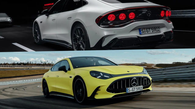
New Electric Mercedes-AMG GT 4-Door Coupe Unveiled: 10 Things You Need to Know
Verdad Gallardo
6 Mercedes Models That Did NOT Age Well (But Are Somehow Still Cool)
Verdad Gallardo
Manual Mercedes? 6 Times Sindelfingen Let Drivers Have All The Fun
Verdad Gallardo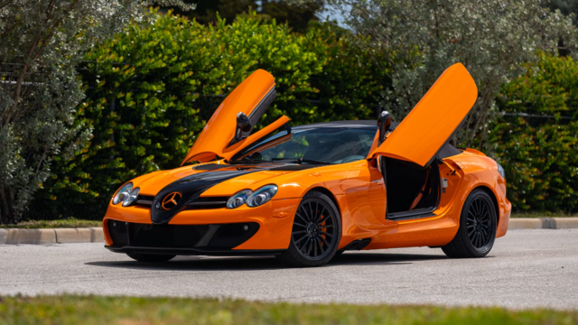
Mercedes SLR McLaren 722 S Is Extremely Rare Example Modified by McLaren
Verdad Gallardo
8 Classic Boxy Mercedes Designs That Have Aged Like Fine Wine
Verdad Gallardo
Flawlessly Restored Mercedes 190E Evo II Heads to Auction
Verdad Gallardo
Member
Joined: Mar 2004
Posts: 170
Likes: 0
From: San Francisco Bay Area
2003 SL500
Usability comments on COMAND
Originally Posted by MBenzNL
...honestly I think that the CD rom based comands ARE infact VERY userfriendly...
1. In the "Points of Interest" - there is a selection for "Dining". Select it, and then there is a single sub-item, "Restaurants". Much friendlier to collapse that hierarchy and save one click. Similarly, the top-level of the hierarchy does not fit on a single screen, leading one to wish to scroll to see if one of the other categories is more appropriate, then scroll back.
2. Again, under "Points of Interest", select (say) "Grocery Stores", and I get a list with something like 37 entries saying "7-11", another 50 or so saying "Safeway". Basically just an alphabetical listing of every grocery store in the navigation area, with no way to find which one is which. Only after much education do we find the "sort by distance" option, which should be the default, but there is not even any way to make this setting "stick".
3. If you select an item from the "Points of Interest", then you get a cryptic and user-unfriendly menu saying something like "Next Object/Previous Object/Main Menu/Navigation". These entries might be meaningful to the programmer writing the system, but they are very opaque to the user.
4. If you now select "Navigation", you end up having to twice click "OK" on the address of the place (with one intermediate screen for the routing options, I think). Unnecessary clicks are not user-friendly.
5. When navigating, or viewing the "Route List", there is no indication of whether an upcoming turn is a left or right, until the audio announcement. I like to see L on Main Street, R on Elm Street, etc. The Acura Navigation system, for example, shows the next three route instructions in the Nav display, with the turn directions.
6. In general, most operations seem to require at least one and usually two clicks more than necessary, because the software always wants to offer you choices which you very rarely want. A better design would be to make the default choices easier, and provide separate menu options to change them.
7. The menu responses are very slow, even in situations where there is a very limited set of choices that need to be made. This, combined with the excess clicks that the UI requires, mean that it takes a long time to enter instructions, since you have to enter data, click, wait, click, wait, click, wait, click. During this time, you either have to stay parked, or be distracted from the road.
8. Finally, the system is also slow to calculate routes. Quite often, it is not ready to provide instructions until well after I have passed the first one or two decision points after starting a journey on residential streets.
Examples of products I think have good usability are Nokia cellphones. I am also quite a fan of Jakob Nielsen's website usability guidelines: Jakob Nielsen's useit.com website
All that said, I don't imagine I'd want to use the Karputer.

Almost a Member!
Joined: Sep 2004
Posts: 39
Likes: 0
COMAND is a pretty solid system. As with any device of this nature, it's going to have it's pros and cons. Some usability aspects make sense and are helpful, some may seem a little more complex or unclear. Either way, I think in the case of COMAND, the pros outweigh the cons, and that it is superior to other units out there. Especially positive about the unit is the look it provides in the vehicle. After all, COMAND was designed for Mercedes-Benz vehicles. It's going to look much better in Mercedes-Benz vehicles than most aftermarket options out there (at least without any major modification/work).
I personally like the system, but I can see how not everyone will feel the same.
ToonArmy: I do agree about the default settings issue in particular. There should be a way to save customized settings in that regard. It does make sense that sort by distance be the default setting. This is like I said -- the unit has pros and cons, this being one of the cons. It doesn't really make the unit any less functional but it can prove to be frustrating at times.
Member
Joined: Mar 2004
Posts: 170
Likes: 0
From: San Francisco Bay Area
2003 SL500
Orcberg,
Just to clarify, I certainly agree that COMAND is the best choice for a MB, being the best fit from both an aesthetic and functional integration standpoint.
However, I was trying to provide some constructuve suggestions to MB to help improve the usability of future systems - the current COMAND has, in my opinion, lots of room to improve. I would hope that MB would strive to provide an excellent product for their customers, not rely on the fact that they have the "default" market position advantage over after-market providers.
While I have not used any aftermarket products, I have used the Acura OEM system, and I have to say that the designers of that system appear to have paid more attention to the UI and usability, and the system is, to my mind, easier to use as a result.
While that in itself would not be sufficient reason to alter the choice of vehicle for many people (as opposed to all the other positive qualities), a designer of great automobiles (which MB is) should aspire to be top-notch in all aspects of design.
Just my opinion and philosophy of prodct design.

Member
Joined: May 2004
Posts: 150
Likes: 0
From: Chicago
66 230S 111.010 02 G500 463
Originally Posted by ToonArmy
With respect, I find the UI of the CD-ROM COMAND on my R230 to be quite crude from a usability point of view. Some examples of specific items that could very easily be made much more usable (I hope MB will take these as suggestios for improving the product):
1. In the "Points of Interest" - there is a selection for "Dining". Select it, and then there is a single sub-item, "Restaurants". Much friendlier to collapse that hierarchy and save one click. Similarly, the top-level of the hierarchy does not fit on a single screen, leading one to wish to scroll to see if one of the other categories is more appropriate, then scroll back.
2. Again, under "Points of Interest", select (say) "Grocery Stores", and I get a list with something like 37 entries saying "7-11", another 50 or so saying "Safeway". Basically just an alphabetical listing of every grocery store in the navigation area, with no way to find which one is which. Only after much education do we find the "sort by distance" option, which should be the default, but there is not even any way to make this setting "stick".
3. If you select an item from the "Points of Interest", then you get a cryptic and user-unfriendly menu saying something like "Next Object/Previous Object/Main Menu/Navigation". These entries might be meaningful to the programmer writing the system, but they are very opaque to the user.
4. If you now select "Navigation", you end up having to twice click "OK" on the address of the place (with one intermediate screen for the routing options, I think). Unnecessary clicks are not user-friendly.
5. When navigating, or viewing the "Route List", there is no indication of whether an upcoming turn is a left or right, until the audio announcement. I like to see L on Main Street, R on Elm Street, etc. The Acura Navigation system, for example, shows the next three route instructions in the Nav display, with the turn directions.
6. In general, most operations seem to require at least one and usually two clicks more than necessary, because the software always wants to offer you choices which you very rarely want. A better design would be to make the default choices easier, and provide separate menu options to change them.
7. The menu responses are very slow, even in situations where there is a very limited set of choices that need to be made. This, combined with the excess clicks that the UI requires, mean that it takes a long time to enter instructions, since you have to enter data, click, wait, click, wait, click, wait, click. During this time, you either have to stay parked, or be distracted from the road.
8. Finally, the system is also slow to calculate routes. Quite often, it is not ready to provide instructions until well after I have passed the first one or two decision points after starting a journey on residential streets.
Examples of products I think have good usability are Nokia cellphones. I am also quite a fan of Jakob Nielsen's website usability guidelines: Jakob Nielsen's useit.com website
All that said, I don't imagine I'd want to use the Karputer.

Member
Joined: Mar 2004
Posts: 170
Likes: 0
From: San Francisco Bay Area
2003 SL500
Originally Posted by mb230s
9. When in "Points of Interest" - any submenu: One should be able to browse using the number pad similiar to dialing a phone number by letters. For example, I want to skip to the restaurants that start with "K" - hit 5 twice. You could also skip all the "Safeway" listings by navigating to "T" by hitting 8.
MBWorld Fanatic!
Joined: Jun 2002
Posts: 3,559
Likes: 4
From: Las Vegas, NV USA / London, UK
GL320CDI / C63 Edition 507 Coupe (EDP) / E63 S (on order) / G500 / Smart Brabus
Originally Posted by ToonArmy
With respect, I find the UI of the CD-ROM COMAND on my R230 to be quite crude from a usability point of view. Some examples of specific items that could very easily be made much more usable (I hope MB will take these as suggestios for improving the product):
1. In the "Points of Interest" - there is a selection for "Dining". Select it, and then there is a single sub-item, "Restaurants". Much friendlier to collapse that hierarchy and save one click. Similarly, the top-level of the hierarchy does not fit on a single screen, leading one to wish to scroll to see if one of the other categories is more appropriate, then scroll back.
1. In the "Points of Interest" - there is a selection for "Dining". Select it, and then there is a single sub-item, "Restaurants". Much friendlier to collapse that hierarchy and save one click. Similarly, the top-level of the hierarchy does not fit on a single screen, leading one to wish to scroll to see if one of the other categories is more appropriate, then scroll back.
2. Again, under "Points of Interest", select (say) "Grocery Stores", and I get a list with something like 37 entries saying "7-11", another 50 or so saying "Safeway". Basically just an alphabetical listing of every grocery store in the navigation area, with no way to find which one is which. Only after much education do we find the "sort by distance" option, which should be the default, but there is not even any way to make this setting "stick".
3. If you select an item from the "Points of Interest", then you get a cryptic and user-unfriendly menu saying something like "Next Object/Previous Object/Main Menu/Navigation". These entries might be meaningful to the programmer writing the system, but they are very opaque to the user.

5. When navigating, or viewing the "Route List", there is no indication of whether an upcoming turn is a left or right, until the audio announcement. I like to see L on Main Street, R on Elm Street, etc. The Acura Navigation system, for example, shows the next three route instructions in the Nav display, with the turn directions.
7. The menu responses are very slow, even in situations where there is a very limited set of choices that need to be made. This, combined with the excess clicks that the UI requires, mean that it takes a long time to enter instructions, since you have to enter data, click, wait, click, wait, click, wait, click. During this time, you either have to stay parked, or be distracted from the road.
8. Finally, the system is also slow to calculate routes. Quite often, it is not ready to provide instructions until well after I have passed the first one or two decision points after starting a journey on residential streets.
8. Finally, the system is also slow to calculate routes. Quite often, it is not ready to provide instructions until well after I have passed the first one or two decision points after starting a journey on residential streets.
Examples of products I think have good usability are Nokia cellphones.

-s-
Member
Joined: Mar 2004
Posts: 170
Likes: 0
From: San Francisco Bay Area
2003 SL500
Originally Posted by scorchie
Hmm, that's why I go through the hassle to get a Nokia in my cars... but then you should understand why I don't care for S-E phones... but who is getting one of those?
-s-
-s-
I was very reluctant to switch away from Nokia, but I had to get a new phone, and there wasn't a Nokia 850/1800/1900 MHz phone available with a decent form factor and calendar/addressbook syncing. I waited as long as I could using my old 8290 after the 6100 took a dunking, but the Nokia 6230b (the most reasonable choice) just wasn't making it over here, so eventually I had to settle for the S-E 637. It's clearly not as good as Nokia on the UI usability, but it is usable (unlike a Motorola).
And I'm told it integrates better with the COMAND than the Nokias do :-) So at this point I'm probably sticking with it until the next-gen Nokias (series-60 or successor) are available in a small form-factor.
Back on topic: glad to hear the newer COMAND systems have made improvements. I was somewhat surprised that a 2003 release of a brand-new model carried over the older units. And also surprised to hear about MB having maintained separate MCS systems in parallel with COMAND.
One small point regarding the direction of the next manouever - I believe it only does that once it starts to announce the manouever (prepare to turn right) - until that point it just shows a straight arrow with the distance to the next manouever. This is from memory, so I'm willing to stand corrected on it.


