When you click on links to various merchants on this site and make a purchase, this can result in this site earning a commission. Affiliate programs and affiliations include, but are not limited to, the eBay Partner Network.
When i recently bought the '14 E350, i noticed there was something different with the "E350" badge. It became more apparent after watching some 2014 E350 reviews on youtube, that the earlier year 2014 E350s had a different font/badge design compared to the mid year 2014 E350s. I noticed that the earlier year '14s had a flat font, vs compared to mine with the font more dimensional.
Here are some pictures..are all the other E350s here have the same font style or are some flat as well?
I dont know if that made sense...but def random thread.
Its not flat compared to some I've seen, the font is more dynamic, especially by touch, it definitely differs from the font of my C32 & SL55
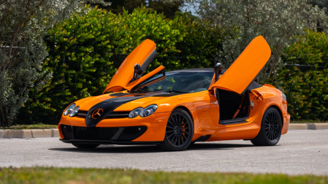
Mercedes SLR McLaren 722 S Is Extremely Rare Example Modified by McLaren
Slideshow: A one-of-one U.S.-spec Mercedes-Benz SLR McLaren Roadster became even rarer after a factory-backed transformation at McLaren's headquarters.