Another Brabus blackseries


Thread Starter
Newbie
Joined: Jan 2009
Posts: 3
Likes: 0
GTR
Another Brabus blackseries
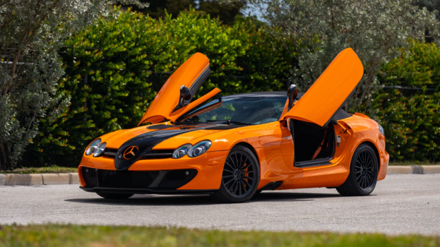
Well i saw this on a site its called the Brabus Stealth and its for another client in dubai. i heard this one is more powerful then the vanish, it produces 820hp on the wheel instead of 788hp.


I actually like it! it looks more simple but aggressive at the same time. thank god they didnt go for the matte foil idea!
I actually like it! it looks more simple but aggressive at the same time. thank god they didnt go for the matte foil idea!
MBWorld Fanatic!
Joined: Feb 2004
Posts: 9,155
Likes: 20
From: Southern, CA.
V12-Biturbo
It has the same Brabus T65 RS badging on top of the CF covered coil packs, but says 800HP instead of 788 HP, this is measured @ the CRANK NOT the wheels. This Black isn't making 820 rwhp, w/OUT extensive Turbo upgrades, they didn't even add the Ram-Air system to either of these Brabus Pajama models (Still have factory SL65 BS OEM Air intake setups in place)
INMOP Brabus is making some horrible design accents/badging decisions lately, Stealth? Vanish? Looks like some cheap Domestic Dodge Stealth/etc badging WTF?
INMOP Brabus is making some horrible design accents/badging decisions lately, Stealth? Vanish? Looks like some cheap Domestic Dodge Stealth/etc badging WTF?
Last edited by Thericker; May 21, 2010 at 06:34 PM.


MBWorld Fanatic!
Joined: Feb 2004
Posts: 9,155
Likes: 20
From: Southern, CA.
V12-Biturbo
 (I already ripped on it in the other thread on the Vanish Pajama model)
After viewing these pix again I have to elaborate on the thoughtless rear badging & door sill designs, WTF? They used some crummy THIN average Fonts below BRABUS/ it looks like such a tacked on POS! Why not add a little creativity/unique flair to these pieces??? Either replicate in BRABUS Font or something 1 off special? This is just KRAP...

Last edited by Thericker; May 21, 2010 at 10:27 PM.

Super Member


Joined: Sep 2007
Posts: 631
Likes: 2
From: Paris.
E320
But that really looks horrible.
MBWorld Fanatic!
Joined: Jan 2007
Posts: 2,597
Likes: 19
From: Kuwait
CLS55 2006, CLS 63S 2015
The SL blk already has a different intake bigger turbos and a few other goodies. As you all know the heat is what kills this engine and with that cooling setup it might just do the trick.
I am not a believer in ''i'll just stick ice in my trunk and be fine for 1-2 runs.'' That ice will go bye bye in top speed / prolonged runs.
It is ugly i admit, but it is a functional design. I have seen the performance of the brabus T65S several times... it is no slush and this tops it
I am not a believer in ''i'll just stick ice in my trunk and be fine for 1-2 runs.'' That ice will go bye bye in top speed / prolonged runs.
It is ugly i admit, but it is a functional design. I have seen the performance of the brabus T65S several times... it is no slush and this tops it
It has the same Brabus T65 RS badging on top of the CF covered coil packs, but says 800HP instead of 788 HP, this is measured @ the CRANK NOT the wheels. This Black isn't making 820 rwhp, w/OUT extensive Turbo upgrades, they didn't even add the Ram-Air system to either of these Brabus Pajama models (Still have factory SL65 BS OEM Air intake setups in place)
INMOP Brabus is making some horrible design accents/badging decisions lately, Stealth? Vanish? Looks like some cheap Domestic Dodge Stealth/etc badging WTF?
INMOP Brabus is making some horrible design accents/badging decisions lately, Stealth? Vanish? Looks like some cheap Domestic Dodge Stealth/etc badging WTF?