, truly, I hadn't noticed them
 ")


the ads now at the top of mbworld
Thread Starter
MBWorld Fanatic!
Joined: May 2002
Posts: 8,189
Likes: 1
From: SF
2007 VW GTI
the ads now at the top of mbworld
i don't mind the ads, but their placement is a bit obnoxious IMHO. on the other forum i use, the ads are to the right of the forum logo, above the "user cp, search" (etc.) buttons. i find this much better than forcing users to scroll down 200 pixels.
just my .o2
just my .o2

Super Member
Joined: Mar 2002
Posts: 879
Likes: 0
From: Toronto
SLK 350 '05
i agree with Session. i don't like the ads. it bugs me, and i don't really like online advertisements. maybe it could be placed elsewhere so that i don't have to scroll the 200 pixels. above the user CP is good..
MBWorld Fanatic!
Joined: Nov 2001
Posts: 3,600
Likes: 1
From: Earth
GLB 250 4matic
well, you need advertising. but it should be better laid out on the top. either increase the width of the banner, or not center it.
or redesign the top so that it better integrates the banner ad.
--
i'd put the mbworld banner on top, move the ad banner below, and then the forum. (basically switch the location of the mbworld and ad banners)
or redesign the top so that it better integrates the banner ad.
--
i'd put the mbworld banner on top, move the ad banner below, and then the forum. (basically switch the location of the mbworld and ad banners)
Last edited by young; Oct 23, 2002 at 08:34 PM.
Trending Topics
MB World Stories
The Best of Mercedes & AMG

New Mercedes-AMG SUVs Arrive With NEW V8 Engine: 12 Things You Need to Know
Verdad Gallardo
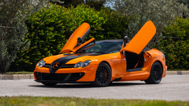
8 Oddball Mercedes Ideas That Actually Made it to Production
Verdad Gallardo
Dubai Tuner Gives the Mercedes G-Class An Entirely New Look
Verdad Gallardo
Six Gift Ideas Your AMG Loving Dad or Grad Will Cherish

7 Craziest Things AMG Gas Ever Built
Verdad Gallardo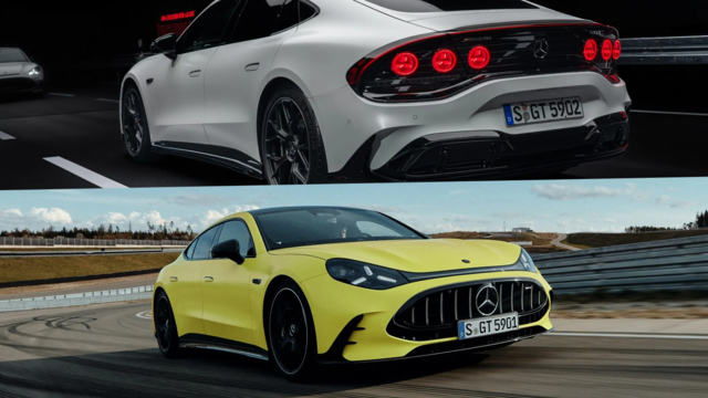
New Electric Mercedes-AMG GT 4-Door Coupe Unveiled: 10 Things You Need to Know
Verdad Gallardo
6 Mercedes Models That Did NOT Age Well (But Are Somehow Still Cool)
Verdad Gallardo
Manual Mercedes? 6 Times Sindelfingen Let Drivers Have All The Fun
Verdad Gallardo