


What exactly does it do
Thread Starter
MBWorld Fanatic!
Joined: Aug 2007
Posts: 1,041
Likes: 19
From: Los Angeles,Belgrade.Current Residence Zurich.
2017 Mercedes Benz E220D/GONE!JUNK!Current GLC Coupe 350d 4 Matic
What exactly does it do
The Menu Button/Switch on the AC ?
You press it and it just shows where the air blows?Is that all?Seems kinda pointless...
You press it and it just shows where the air blows?Is that all?Seems kinda pointless...

MBWorld Fanatic!


Joined: Oct 2014
Posts: 4,524
Likes: 1,181
From: WI
17 E43; 21 GLS580
That is exactly what it does, it brings up the AC display that shows you the air distribution. I essentially never use it but some people might find it useful and it looks cool.

Senior Member

Joined: Jan 2009
Posts: 361
Likes: 28
Past 03 SL500,03 C240, 07 E350, 07 ML350, 10 ML350,11&14 E350 X2 2017 E300, 2017 C350e & 2000 S500
The button is such a waste of useful space. it didn't need to be that big, the fan speed and temperature could have been wider instead.

Junior Member
Joined: Apr 2017
Posts: 53
Likes: 8
From: Ontario, Canada
2017 E400
Agreed. In fact I keep in auto so really only use the temp which could have been wider instead. Sometimes I don't hit it the first time and hit auto instead or I hit the fan button then have to press auto again. Nitpicking though. The design is nice.
MBWorld Fanatic!
Joined: Jun 2008
Posts: 2,073
Likes: 85
From: San Francisco, CA
2017 E300
On the C class, you get a nice visual representation of fan speed, temp, and vent. On the E, its useless because they are using the same band of buttons on both cars but changed the software
Junior Member
Joined: Apr 2017
Posts: 53
Likes: 8
From: Ontario, Canada
2017 E400
Also once we are at it. I like when in radio mode you see the digital read out of temp stuff at bottom. But when in nav it disappears unless you are adjusting it. They have so much room so why not display it at bottom with street name off to side or something.
Trending Topics

Senior Member
Joined: Oct 2016
Posts: 289
Likes: 59
E220d
Don't get me started on wasted space in nav screen! High Res, pointlessly wide (who cares about roads 5 miles away to the sides) and all they put on it is ETA/traffic delay/remaining distance all wedged in to a postage stamp box. Why the hell doesn't it have now and next turn info in a side box with constant distance countdown? Super useful and tons of space to do it.
The nav system, actually most of the software, is pretty to look at but shallow as hell.
MB World Stories
The Best of Mercedes & AMG

7 Craziest Things AMG Gas Ever Built
Verdad Gallardo
New Electric Mercedes-AMG GT 4-Door Coupe Unveiled: 10 Things You Need to Know
Verdad Gallardo
6 Mercedes Models That Did NOT Age Well (But Are Somehow Still Cool)
Verdad Gallardo
Manual Mercedes? 6 Times Sindelfingen Let Drivers Have All The Fun
Verdad Gallardo
Mercedes SLR McLaren 722 S Is Extremely Rare Example Modified by McLaren
Verdad Gallardo
8 Classic Boxy Mercedes Designs That Have Aged Like Fine Wine
Verdad Gallardo
Flawlessly Restored Mercedes 190E Evo II Heads to Auction
Verdad Gallardo
Electric Mercedes C-Class Unveiled: 11 Things You Need to Know
Verdad Gallardo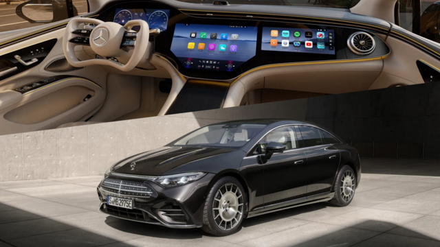
Mercedes EQS Gets A Major Update: Everything You Need to Know
Verdad Gallardo
Junior Member
Joined: Apr 2017
Posts: 53
Likes: 8
From: Ontario, Canada
2017 E400
Don't get me started on wasted space in nav screen! High Res, pointlessly wide (who cares about roads 5 miles away to the sides) and all they put on it is ETA/traffic delay/remaining distance all wedged in to a postage stamp box. Why the hell doesn't it have now and next turn info in a side box with constant distance countdown? Super useful and tons of space to do it.
The nav system, actually most of the software, is pretty to look at but shallow as hell.
Also, in dash why not show trip, odometer and distance to empty? They show a clock 50 places but not that?
Thry should look at Audi virtual cockpit. It is more common sense with info without clutter and customizable too.
The Mercedes system is good. Just not fully realized or common sense in a few key places or customer changeable.


