


MBWorld Fanatic!
such a huge gauge for the clock? lame.
i suppose i'm one of the few that really likes the CL203 gauges.
i suppose i'm one of the few that really likes the CL203 gauges.
MBWorld Fanatic!
TimmyC230boy
MBWorld Fanatic!
close
Apr 12, 2011
I like it, it different, but i like it.
MBWorld Fanatic!
i like it a lot - but i also think the clock is strangely prominent... seems like they just wanted to balance the gauges (the tachometer) w/ it.
MBWorld Fanatic!
Quote:
Originally posted by JoReL
not bad at all...whut car is it?
Guess it's from the new E-class (W211). Looks really nice IMO.Originally posted by JoReL
not bad at all...whut car is it?

Almost a Member!
It is from the 03 CLK. The only drawback is the blue instrument lights do not match the orange stereo and AC lights (Poor planning) I also agree the large clock screams afterthought.
MBWorld Fanatic!
Well, at least the tachometer is on the right and it's full scale...
MB World Stories
The Best of Mercedes & AMG
Explore

Manual Mercedes? 6 Times Sindelfingen Let Drivers Have All The Fun
Verdad Gallardo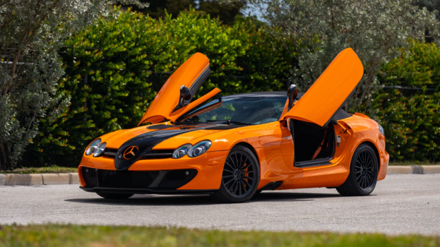
Mercedes SLR McLaren 722 S Is Extremely Rare Example Modified by McLaren
Verdad Gallardo
8 Classic Boxy Mercedes Designs That Have Aged Like Fine Wine
Verdad Gallardo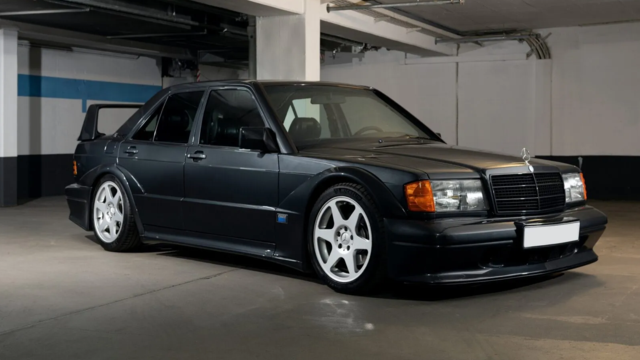
Flawlessly Restored Mercedes 190E Evo II Heads to Auction
Verdad Gallardo
Electric Mercedes C-Class Unveiled: 11 Things You Need to Know
Verdad Gallardo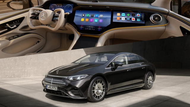
Mercedes EQS Gets A Major Update: Everything You Need to Know
Verdad Gallardo
5 Underrated Mercedes-Benz Models That Don't Get the Love They Deserve
Verdad Gallardo
Mercedes 300D Has Pushed Well Past 1 Million Miles and It Ain't Stopping
Verdad Gallardo
10 Most Reliable Mercedes-Benz Models You Can Buy Used
Verdad GallardoSuper Member
If its got the same features as the new E-class, then it will also have illuminated interior door release housing. Pretty amazing when you first see it!


looks cool. that dash in on both the W211 E-class and the W209 CLK-class. having seen the new CLK the other day the white-ish blue hue for the dash board works really well with the center console
Admin Alumni
For my part, I don't like the lighting. White needles on a pastel background are hard to see, IMO. Moving the tach to the right side does make it easier to see the low rev side (the most useful side) of the tach, but the gauge overall isn't significantly larger to make it a real improvement.
The clock is not only an afterthought, IMO, it should not be in the instrument cluster at all. This is one of my pet peeves of the current C-Class gauges. Passengers can't read the clock. Clocks should be centrally mounted (in the Radio display) where all occupants can see it. Instrument panel placement is just dumb.
Instead, I would prefer the clock space be used for combination gas gauge and temperature gauge, rather than the miniscule slider gauges to the right and left periphery, where they are easy to overlook.
Finally, since the gas filler flap is on the right side of the new CLK, MB has taken a step backward in placing the gas gauge on the left side of the pod! Designers get ergonomic kudos when they place the gas gauge to whichever side of the pod that indicates the placement of the gas filler, like in the current C-Class. What a goof!

Member
I think they're a step in the right direction. I would prefer to see a cluster with a large speedo and tach with smaller oil pressure, temp, and/or battery charge info. The colors are interesting, kind of VW in my opinion. Would love to see an instrument cluster in green since that's the color our eyes see best at night.......
Quote:
Originally posted by MB-BOB
For my part, I don't like the lighting. White needles on a pastel background are hard to see, IMO. Moving the tach to the right side does make it easier to see the low rev side (the most useful side) of the tach, but the gauge overall isn't significantly larger to make it a real improvement.
The clock is not only an afterthought, IMO, it should not be in the instrument cluster at all. This is one of my pet peeves of the current C-Class gauges. Passengers can't read the clock. Clocks should be centrally mounted (in the Radio display) where all occupants can see it. Instrument panel placement is just dumb.
Instead, I would prefer the clock space be used for combination gas gauge and temperature gauge, rather than the miniscule slider gauges to the right and left periphery, where they are easy to overlook.
Finally, since the gas filler flap is on the right side of the new CLK, MB has taken a step backward in placing the gas gauge on the left side of the pod! Designers get ergonomic kudos when they place the gas gauge to whichever side of the pod that indicates the placement of the gas filler, like in the current C-Class. What a goof!
other than the W203 C-class, MB always had their tach on the right hand side.Originally posted by MB-BOB
For my part, I don't like the lighting. White needles on a pastel background are hard to see, IMO. Moving the tach to the right side does make it easier to see the low rev side (the most useful side) of the tach, but the gauge overall isn't significantly larger to make it a real improvement.
The clock is not only an afterthought, IMO, it should not be in the instrument cluster at all. This is one of my pet peeves of the current C-Class gauges. Passengers can't read the clock. Clocks should be centrally mounted (in the Radio display) where all occupants can see it. Instrument panel placement is just dumb.
Instead, I would prefer the clock space be used for combination gas gauge and temperature gauge, rather than the miniscule slider gauges to the right and left periphery, where they are easy to overlook.
Finally, since the gas filler flap is on the right side of the new CLK, MB has taken a step backward in placing the gas gauge on the left side of the pod! Designers get ergonomic kudos when they place the gas gauge to whichever side of the pod that indicates the placement of the gas filler, like in the current C-Class. What a goof!
i prefer the clock on the center console too, so i don't have to answer my passenger everytime they ask. i can just tell'em "look on the center console, dumbass"
Super Member
Quote:
Originally posted by FrankW
i prefer the clock on the center console too, so i don't have to answer my passenger everytime they ask. i can just tell'em "look on the center console, dumbass"
One would think that most of our passengers are wearing one of those wrist-mounted clocks. So the position of a clock on the dash should be mostly irrelevant.Originally posted by FrankW
i prefer the clock on the center console too, so i don't have to answer my passenger everytime they ask. i can just tell'em "look on the center console, dumbass"

Almost a Member!
I'm not thrilled with the display shown, but I do wish the C-coupe's tach were bigger. I find it's too small and one's hand at the 10-o'clock position tends to block it a bit. I know MB would never do the 911- style "tach in center approach," but for the Coupe, they could have gotten away with it.
Quote:
Originally posted by viper
One would think that most of our passengers are wearing one of those wrist-mounted clocks. So the position of a clock on the dash should be mostly irrelevant.
what i said was from experience giving rides to my friends. that does not necessary apply to all people of course. to me it is relevant. Originally posted by viper
One would think that most of our passengers are wearing one of those wrist-mounted clocks. So the position of a clock on the dash should be mostly irrelevant.

Super Member
i find that blue indiglo looking display kind of irritating on the eyes. I think the amber display of the 203 is a bit easier on your eyes. However the round shaped MFD is a big improvement
My favorite illuminated dash at night has got to be the rsx, red numbering may not be really functional, but it sure is cool looking.
My favorite illuminated dash at night has got to be the rsx, red numbering may not be really functional, but it sure is cool looking.
Currently Active Users (1)


