


Let's talk rearends! w210 vs w211

Thread Starter
Member
Joined: Sep 2002
Posts: 235
Likes: 0
From: NY
2003 s500 sport
Let's talk rearends! w210 vs w211
Which one do you like better. Please ignore the fact that this thread is posted in w211 area. Ignore the fact that I drive e430.
The rear of w210 is just so good looking. it looks very mascular and solid in my opinion. I fell in love with the new E also but the older E has a much better behind IMHO.

I do like the new w211 a lot and just about everything inside and outside and am waiting for the day when I can get my own w211 e55.
The rear of w210 is just so good looking. it looks very mascular and solid in my opinion. I fell in love with the new E also but the older E has a much better behind IMHO.
I do like the new w211 a lot and just about everything inside and outside and am waiting for the day when I can get my own w211 e55.
Thread Starter
Member
Joined: Sep 2002
Posts: 235
Likes: 0
From: NY
2003 s500 sport
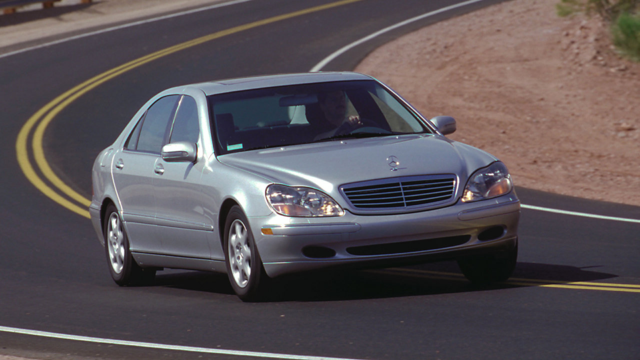
w211 is a little rounded and perhaps that's where the angled comment came from. They were obvously trying to go with the SL rear styling but it looks much much better on the SL.

Member
Joined: May 2002
Posts: 205
Likes: 0
To me, there is nothing about the W210 that I prefer over the W211 - everything about the W211 is more beautiful, muscular, and/or sporty.
(not the best pictures, but the same company took them (Ebay shots) in the same location.


(not the best pictures, but the same company took them (Ebay shots) in the same location.
Trending Topics

Senior Member
Joined: Sep 2002
Posts: 271
Likes: 0
From: Florida
2012 CLS63
I think the rear end on the 211 is one of the nicer styling changes made to the E class. The 210 was quite square compared to the rounded lines on the rest of the car. One can easily see this from a side view. However, I think the front end of the 210 has much more MB character than the 211.
MB World Stories
The Best of Mercedes & AMG

Manual Mercedes? 6 Times Sindelfingen Let Drivers Have All The Fun
Verdad Gallardo
Mercedes SLR McLaren 722 S Is Extremely Rare Example Modified by McLaren
Verdad Gallardo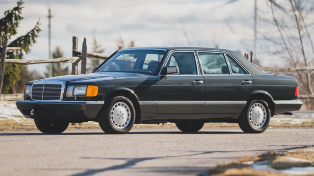
8 Classic Boxy Mercedes Designs That Have Aged Like Fine Wine
Verdad Gallardo
Flawlessly Restored Mercedes 190E Evo II Heads to Auction
Verdad Gallardo
Electric Mercedes C-Class Unveiled: 11 Things You Need to Know
Verdad Gallardo
Mercedes EQS Gets A Major Update: Everything You Need to Know
Verdad Gallardo
5 Underrated Mercedes-Benz Models That Don't Get the Love They Deserve
Verdad Gallardo
Mercedes 300D Has Pushed Well Past 1 Million Miles and It Ain't Stopping
Verdad Gallardo
10 Most Reliable Mercedes-Benz Models You Can Buy Used
Verdad Gallardo
Thread Starter
Member
Joined: Sep 2002
Posts: 235
Likes: 0
From: NY
2003 s500 sport
I posted the same question on w210 forum but here I get more action. Even though I have an e430 I do think that w211 is nicer all around and you can see the evolution of the design which is why I will always drive a Benz.
The differences of opinions make me realize how difficult it must be for the MB design team to come up with those great designs. At least they get it right and not like the guys from the BMW 7 series design team.
The differences of opinions make me realize how difficult it must be for the MB design team to come up with those great designs. At least they get it right and not like the guys from the BMW 7 series design team.

Senior Member
Joined: Jul 2002
Posts: 484
Likes: 0
From: Melbourne, Australia
The rear end of the W210 was almost a stand alone style for MB which was not followed through to other models-for which I for one am glad.
Besides the two door version,the CLK and the SL,that style of rear light (with the tail lights either side of the boot lid cut) died with the SLK and W202 C Class which adopted the new triangular theme,which is still used today.
The first version of the W210 was even worse as it incorperated two round ovals in the design to try and blend it in with the round oval headlights.
IMHO the W211 is a better design from every angle.As soon as I saw the W210 in 1995 I didn't like it and am not convinced to this day that the design works.
The W211 is what the W210 should have looked like when it was released way back then.A much smoother front end, a tauter side and the MB themed rear end,while the interior is light years ahead.
The moment I saw it I loved it and it still grabs my attention every time I see one drive by.
Last edited by Callaway; Jan 18, 2003 at 05:28 PM.
Member
Joined: Dec 2002
Posts: 101
Likes: 0
From: Santa Cruz, CA
'03 E320
Style and Cost
I really like the way MB was able to incorporate exceptional styling and a cost effective design.
The styling speaks for itself. The cost effectiveness comes from minimizing the number of parts, and location of lights to simplify electrical harness routing. Note that the L & R tail lights are contained within the rear qtr panels, not split up like previous design. And the center stop lamp is now located at the rear top of the trunk deck lid, which simplifies harness routing, and makes easier owner housekeeping within the cabin rear deck.
These are some of the MB engineering results that an **** retentive engineer such as myself do appreciate - and they did this without sacrafice to the styling.
MBWorld Fanatic!
Joined: Nov 2001
Posts: 1,377
Likes: 1
From: Vancouver Island, B.C. Canada
2005 smart cabrio; 2008 Mercedes-Benz B 200
Re: Let's talk rearends! w210 vs w211
Originally posted by 6.3
...it looks very mascular...
...it looks very mascular...
 Do you mean muscular?
I think the W 210 was not a particularly good design. What was wrong? Let's see:
1. The round headlights clearly were an afterthought. They do not flow at all into the front fenders. The joint is rather abrupt, as though two stylists worked independently on the front and side and never reconciled the join between the two.
2. What's with the goofy shapes around the side view mirrors? Mercedes would probably say it's for airflow management, but it looks ridiculous and ungainly; other carmakers did a lot better at the time, and still do.
3. The transition from the front fender to the beltline is all wrong. Again, the "two uncommunicative stylists" hypothesis rears its ugly head.
4. The W 210 is slab sided beyond belief. Surely some creativity could have been applied to this expanse of flat sheet metal, without being garish...
5. The high boot line is almost as bad as the 300E. It looks like a fat person's butt, not muscular at all.
Those critiques aside, the W 210 is reasonably presentable. However, they could have done a lot better.
The W 211 corrects these criticisms. It's clear that considerable finesse was applied in making it a whole.


