


2016 E Class Changes?
Junior Member

Joined: May 2012
Posts: 45
Likes: 2
From: Markham, Ontario Canada
2020 GLE 450 2018 C43 AMG, Previous 2016 E550 Coupe, Previous 2012 E550 Coupe
Good eye BeoBenz
For me, I like the flat button look - it reminds me of the steering wheel buttons that are quite flat. I prefer that flush look.
Now the ipad stuck to the dash for me is just such an add on and after thought - much prefer a clean flush inset look.
I find it frustrating that photos depicted on the MBUSA and Canada websites are often out of date or just plain incorrect with disclaimers that even says so.
Is it so much to ask that web photos are current and country relevant?
We shouldn't have to scour dealer websites to see what these cars look like inside and out.
MBWorld Fanatic!
Joined: Oct 2010
Posts: 8,157
Likes: 4,382
From: Corona Del Mar, CA
2019 SL450, 2019 E450 Luxury Trim Wagon, 2024 BMW I7 xDrive60
If I'm not mistaken, the Parktronic package does NOT come with the 360 camera in the 2016 E350. It's only available in the 2014-2015 versions.
I'm referring to US models. Please correct me if I'm wrong. But if you go to mbusa.com and configure an E-class, it will not show 360 camera in the package.
I'm referring to US models. Please correct me if I'm wrong. But if you go to mbusa.com and configure an E-class, it will not show 360 camera in the package.
Super Member
Joined: Sep 2014
Posts: 562
Likes: 43
.
Senior Member
Joined: Mar 2015
Posts: 256
Likes: 8
2016 Mercedes-AMG E63 S Sedan
Awaiting e63S (E63W4S) ordered 3/17 and with a sched build date 3rd decade June which will have the surround view (995). Not sure if it is still offered.
Super Member


Joined: Nov 2013
Posts: 992
Likes: 87
From: Washington DC area
Mine: 2014 E550 4matic; Hers: 2016 CLS 400 4matic
Senior Member
Joined: Mar 2015
Posts: 256
Likes: 8
2016 Mercedes-AMG E63 S Sedan
MB World Stories
The Best of Mercedes & AMG

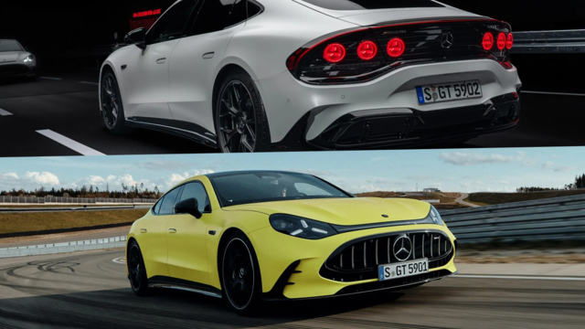
6 Mercedes Models That Did NOT Age Well (But Are Somehow Still Cool)
Verdad Gallardo
Manual Mercedes? 6 Times Sindelfingen Let Drivers Have All The Fun
Verdad Gallardo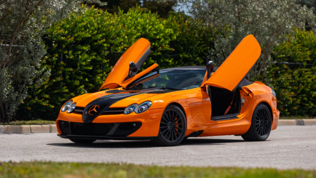
Mercedes SLR McLaren 722 S Is Extremely Rare Example Modified by McLaren
Verdad Gallardo
8 Classic Boxy Mercedes Designs That Have Aged Like Fine Wine
Verdad Gallardo
Flawlessly Restored Mercedes 190E Evo II Heads to Auction
Verdad Gallardo
Electric Mercedes C-Class Unveiled: 11 Things You Need to Know
Verdad Gallardo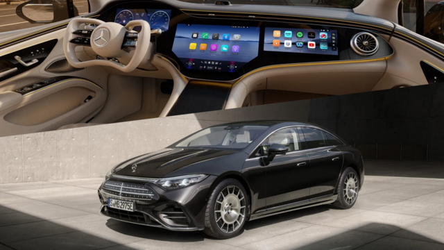
Mercedes EQS Gets A Major Update: Everything You Need to Know
Verdad Gallardo
5 Underrated Mercedes-Benz Models That Don't Get the Love They Deserve
Verdad Gallardo
Mercedes 300D Has Pushed Well Past 1 Million Miles and It Ain't Stopping
Verdad GallardoSuper Member
Joined: Apr 2011
Posts: 639
Likes: 14
From: Suburban Phila., PA
2012 E350 Coupe
Agreed! The "iPad glued to the dash" look completely ruins the interior. If they're going to redesign the interior, then do it right. Integrate the LCD screen properly. You have to wonder if they actually bothered to test this new, pasted on look to get customer feedback before going into production.
I pray Mercedes comes to its senses by the time I'm ready for another one or I will look elsewhere.
What were they thinking?

MBWorld Fanatic!

Joined: Jul 2009
Posts: 1,914
Likes: 261
From: Ontario,Canada
...24 GLE53
I have the tablet style screen in my facelift CLS and I like it. First of all it is larger and sits higher, more in the sight line. I must agree that it looks like an afterthought but it is very functional.
Super Member
Joined: Dec 2014
Posts: 842
Likes: 64
From: Northern NJ
2015 E550 Coupe
The general placement of the LCD screen is fine where it is, as it probably lines up well with being able to keep an eye on the road, while being able to glance at the screen. However, they should have re-designed the dashboard frame to allow for the LCD to be better integrated. It wouldn't have been that hard to do and it would have greatly improve the overall interior look. I mean we're not talking about a Toyota Camry or Nissan Sentra here, where something just pasted on is considered OK. MB is supposed to have a much more well-sculpted and refined look that flows well. Just my two cents.
Super Member
Joined: Dec 2014
Posts: 842
Likes: 64
From: Northern NJ
2015 E550 Coupe
I have no complaint with either the larger size or its location of where MB elected to put the newer style Command screen. They just could have done a much better job of integrating the new LCD screen into the overall front console. See my reply to BenzMan369 for what I mean. Hopefully this current, pasted-on look is only going to be temporary as they transition to a cleaner, better integrated look.
MBWorld Fanatic!
Joined: Oct 2010
Posts: 8,157
Likes: 4,382
From: Corona Del Mar, CA
2019 SL450, 2019 E450 Luxury Trim Wagon, 2024 BMW I7 xDrive60
Member
Joined: Apr 2014
Posts: 124
Likes: 8
From: Sacramento
2019 C43 AMG
I talked to a MB Sales manager and mechanic and they said the reason for the external dashes is to be able to upgrade the screen down the road WHEN the new screens come out, the cost wont be cheap, but the option is there if you have the money to upgrade the screen, also easier to warranty out if it does go out. When the dash is built in, your stuck with that display screen so MB wanted something that would be "upgradable with the fast, moving advances in technology.
MBWorld Fanatic!


Joined: Mar 2014
Posts: 3,107
Likes: 394
From: West Central Florida
2011 E550 P2 4M Sedan
I talked to a MB Sales manager and mechanic and they said the reason for the external dashes is to be able to upgrade the screen down the road WHEN the new screens come out, the cost wont be cheap, but the option is there if you have the money to upgrade the screen, also easier to warranty out if it does go out. When the dash is built in, your stuck with that display screen so MB wanted something that would be "upgradable with the fast, moving advances in technology.

Newbie
Joined: Jun 2015
Posts: 1
Likes: 0
2016 E Sedan
Just picked up my new 2016 E 4matic Sedan - my lease was up on my 2014 E.
Changes i have noticed so far:
-Changed the Comand system to the new system in the C classes. (more complicated and more options)
-you can now flag songs on the radio to alert you when they are playing
-buttons on the radio are flatter as previously mentioned
-Head rests are different - instead of pulling out towards you from the bottom - they now push in from left and right making a cradling U shape
Only issue i am having - the bass from stereo is no where near the quality from my 2014
-not sure if it is the new stereo settings - previously you had treble and bass - now you have treble mids & bass.
-with logic 7 activated now - almost no bass
Junior Member
Joined: May 2012
Posts: 45
Likes: 2
From: Markham, Ontario Canada
2020 GLE 450 2018 C43 AMG, Previous 2016 E550 Coupe, Previous 2012 E550 Coupe
I just picked up a 2016 E550C and quite like the new Command software - icons float and turn like an Apple product.
Ok still not that sophisticated when using NAV but major overall improvement over my 2012.
The flat button look works for me and feels fresher and more up to date.
Ok still not that sophisticated when using NAV but major overall improvement over my 2012.
The flat button look works for me and feels fresher and more up to date.


