When you click on links to various merchants on this site and make a purchase, this can result in this site earning a commission. Affiliate programs and affiliations include, but are not limited to, the eBay Partner Network.
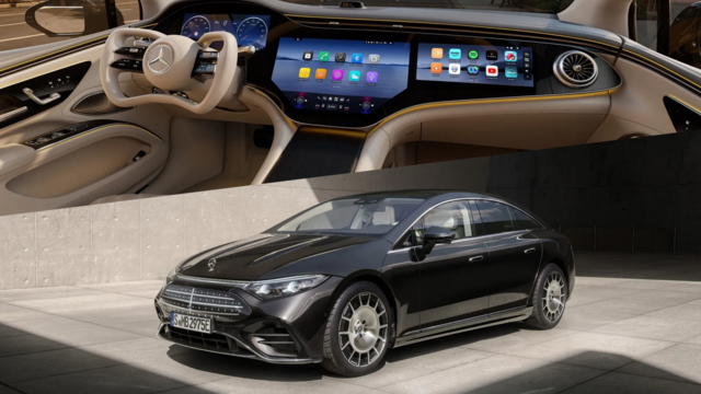
This is the new MBUX (Mercedes-Benz User Experience) infotainment system that will be introduced in the 2019 A-Class. This will likely be released across the board on all models. It will use a touchscreen, touchpad on the center console and Touch-Control Buttons in the steering wheel. The controller wheel will become a thing of the past. What do you gals/guys think? Yea or Nay?
The center DRIVER console can be custom configured to allow things like the map to actually consume a larger area of the screen, so that I can see what is going on
The center console is touch screen. My wife really struggles with the rotating knob. It's something that you have to use for a while to get used to. Even after you get used to it, and know what you need to do, there are still times where it is not intuitive about how to perform an operation
The center console appears to have/use normal touchscreen type functions like, swipe, and pinch-to-zoom, things that we are all familiar with, so there's no learning curve there
I like the "quick" buttons on the center console, for things like changing the radio station and ending navigation. (Ending navigation today is INCREDIBLY painful, and takes way to many unintuitive steps)
The "Hey Merecedes" function. Don't have to push any buttons, just talk to it. And, at the end of the day, there is NO possible way that it can work any worse than the current system. I haven't memorized the current system commands, so I don't use it at all, because it's usually frustrates me because I don't say something quite the way that it wants, and then everything is jacked
Things I don't like about the system:
The center DRIVER console can be custom configured to allow things like the map to actually consume a larger area of the screen, so that I can see what is going on. This is a blessing and a curse. I fear that it will be easier for a driver to become distracted, and possibly information overloaded with too much information in the center driver console. I heard or read a piece recently (can't find it now) that says that some cars are offering TOO much information to the driver, and it's too easy for the driver to become distracted. The article compared the information in the car to texting while driving. We all know that we shouldn't do that, but wouldn't necessarily stop to think that entering a location or watching a HUGE map in front of us, is essentially the same thing. Our eyes and minds are not focused on driving, but rather on the information in front of us
The controls on the steering wheel. There seems to be a LOT of controls on there, and while that's good that the driver doesn't have to take their hands off the wheel to do most stuff, you could still be easily distracted looking for the right button to do whatever it is that want to do on the screen. This is kind of a continuation of the first bullet point, but more control related.
To me, the absolute biggest plus about the system is the center touchscreen, and the way that it works. For my wife, and really for anyone in today's modern society, we all want to drive everything that we touch with the cell phone functionality. I have NO doubt that it will be an order of magnitude easier to navigate a system that uses a touch screen, especially when that touchscreen "works" the way that I think it should work. Our VW had touchscreen on the center console, which was nice, but did NOT have things like pinch-to-zoom, which was frustrating when you wanted to quickly change the view/zoom.
All in all, I love the function of the thing, and I like the information available. I'm not for sure that I could totally control myself, however, while I was driving, and not be distracted. I don't know, however, if I'm a fan of the overall look of the system. Looks gimmicky or something. There's just something about the look of the screens sticking out that I don't like. That's actually something that I'm not fond of either on the GLE, is the way that the center console sticks up out of the center of dash.
This is a shot of the new G Class dash (which I believe is the current E-class setup):
I personally like how the dash wraps around this screen, and it appears to be "part" of the dash.
One problem with both of these setups is going to be that you are going to be forced to have a "flat" dash, since currently LCD's are not build with "curves" in them. Flat doesn't have a lot of sexy appeal to it, and that will be the ultimate challenge. How do you make flat look sexy. (Yes, I know that they have curved TV screens, but that amount of curve on a dash this size would hardly be noticeable).
Again, YMMV...
Last edited by cadman_ks; Jan 13, 2018 at 09:27 AM.
This is a shot of the new G Class dash (which I believe is the current E-class setup):
I personally like how the dash wraps around this screen, and it appears to be "part" of the dash.
One problem with both of these setups is going to be that you are going to be forced to have a "flat" dash, since currently LCD's are not build with "curves" in them. Flat doesn't have a lot of sexy appeal to it, and that will be the ultimate challenge. How do you make flat look sexy. (Yes, I know that they have curved TV screens, but that amount of curve on a dash this size would hardly be noticeable).
Again, YMMV...
I knew there was something I didn't quite like. You hit the nail right on the head. That flat dash looks like something straight out of a 70's Buick. Having the dash wrap around the screen does make it look more like an integral part. But that square, boxy top has got to go. Actually, they could keep the same LCD and just add a curved extension above it. However, that would also impede visibility. Oh well, back to the drawing board.
.... Actually, they could keep the same LCD and just add a curved extension above it. However, that would also impede visibility. Oh well, back to the drawing board.
I thought about that too, and possibly even do that on the sides to some extent. Their going to have to do something there. The inside of the new E-Class already has a screen very similar at least in shape and size (don't know about the touch screen capabilities):
I've sat in one of these, and it's not too bad when you're sitting in it, but it IS a BIG panel, and it's flat, and it's going to be hard to shake that look/feel.
Thinking back on the video, I didn't ever see a situation where they had information on the WHOLE screen. It's like it's still divided into two screens. Why not just have two screens, with a split down the middle? That would at least allow you to sexy up the outside of the two screens. Just a thought.
Don't you just love being armchair designers!!!
With all that being said, the E-Class does look better than the G-Class, IMHO...
Love the dual 12 inch 16:9 screens. The wide aspect ratio is ideal, especially for navigation and watching HD movies.
Love the seemingly infinite customization capabilities. I get bored easily. This is right up my alley.
Love the bold, vibrant colors. Less monotonous than COMAND.
The addition of touch-screen functionality is something a lot of people will welcome. With this many features, a touch-screen is mandatory. Could you imagine trying to use a controller knob with icons all over the screen?
Being able to display an actual map on the center screen is nice.
I think we all have to admit that the 3D graphics are leaps and bonds above COMAND.
CONS -
As cadman mentioned, I'm concerned that the complexity of the entire system might be too distracting.
Using a touchpad without a controller will be more distracting as well. Do you know how much hand-eye coordination and manual dexterity is required to use a touchpad in a moving vehicle?
I hate the two metallic spokes on the steering wheel. The contrast of the text on buttons is not as high as white on black. When you look at the steering wheel, it takes longer to discern the functions. This means your eyes are off the road longer. That's just my own personal perception.
I don't like that fact that they removed the dedicated cruise control stalk. Presently, I can activate/deactivate DISTRONIC PLUS, increase/decrease set speed and increase/decrease following distance, all without ever taking my eyes off the road. Try doing that when you have to squint to read those tiny buttons against a highly reflective background.
Last edited by GLE43_Sube; Jan 14, 2018 at 08:59 AM.
I thought about that too, and possibly even do that on the sides to some extent. Their going to have to do something there. The inside of the new E-Class already has a screen very similar at least in shape and size (don't know about the touch screen capabilities): I've sat in one of these, and it's not too bad when you're sitting in it, but it IS a BIG panel, and it's flat, and it's going to be hard to shake that look/feel.
Thinking back on the video, I didn't ever see a situation where they had information on the WHOLE screen. It's like it's still divided into two screens. Why not just have two screens, with a split down the middle? That would at least allow you to sexy up the outside of the two screens. Just a thought.
Don't you just love being armchair designers!!!
With all that being said, the E-Class does look better than the G-Class, IMHO...
You're correct. You can't have info on the whole screen. It's essentially two separate screens in one LCD. You and I have a difference of opinion on the single screen versus dual screen design. I think having a single, dual purpose screen flows more uniformly. Plus, it's one less place to have to clean dust from.
Agreed, the E-Class does look more modern than the G, although I still prefer knobs to control the HVAC. I hate those flip switches. I also love our sliding cover for the cup holder compartment. It's a bit classier than that flip-up door. Having the open-pore wood trim, my sliding cover is even real wood.
We should get paid for being armchair designers. I swear, if our ideas show up in the final release, somebody's getting sued.
I don't know about you guys/gals, but I wouldn't buy a car with MBUX in its first year release. I would hate to have been a beta tester for COMAND. At least we got in on COMAND after all of the bugs have been worked out. I'm happy to sit back and let somebody else be the guinea pig.
Gotta say for the G class pic, visually, that cockpit isn't very appealing at all. I agree with the all flat assertion above and would also add that the door is awful. The controls on top of the door near the mirror ( assume controls for the mirrors maybe ) looks like little cups to collect drops of rain etc.
It's the AC vents. Those things look terrible. And, if you look at the G-Class, it looks like the "module" that holds the A/C vents was a TOTAL afterthought.
Like one day, a manager was sitting in the car, and he said,
"Where are the A/C vents?"
And all the designers went, "oh sh.."
Designers: "Hey, we have an idea! Let's design another console that sits on top of the console that we already have that we will put the now forgotten A/C vents in!"
And they all patted themselves on the back...
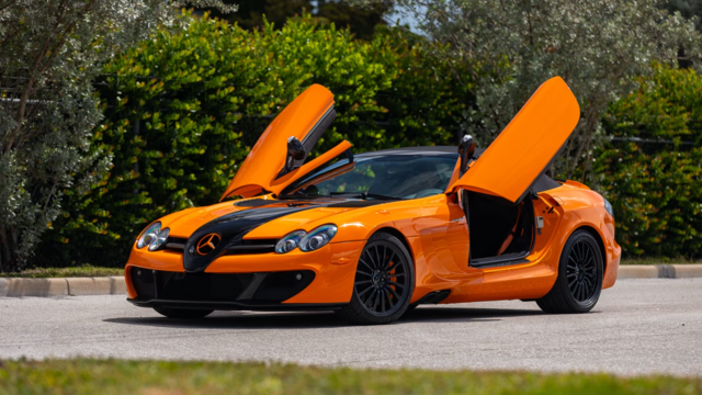
Mercedes SLR McLaren 722 S Is Extremely Rare Example Modified by McLaren
Slideshow: A one-of-one U.S.-spec Mercedes-Benz SLR McLaren Roadster became even rarer after a factory-backed transformation at McLaren's headquarters.